Thursday, September 30, 2010

DAY TWELVE :: In Class & Homework

In Class

  • Look at sitemaps, wireframes
  • Work day

Homework: on Tuesday each team presents:

  1. Sitemap (showing all of the components of your community, even if you are not planning to flush them all out)
  2. Wireframes of all components that you plan to design

    • Wireframes should have text content at this point. What goes in all of those little boxes?
    • Clearly show step by step interaction.
    • Wireframes should be clear enough that you can hand them off to someone else and they will be able to understand and implement your design.
  3. Branding: three directions: color, type, language

  • Start thinking about
    • Copy writing. How can you say "profile" as relevant to a specific community?
    • Look and feel

Tuesday, September 28, 2010

DAY ELEVEN :: In Class & Homework

In Class

  • Look at brand directions and sitemaps/wireframes
  • Talk about Windows and Mirrors intro
  • Work day!


Homework

  • Develop brand direction
  • Develop sitemaps and wireframes
  • Read Windows and Mirrors, document pages 7-19 (from Wooden Mirror to The Macintosh Interface)

Wireframes

Check out Wireframes Magazine for guidance and inspiration for your wireframes and sitemaps.

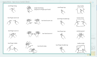
This post about gestures may be particularly helpful when thinking of the iphone/ipad.


Thursday, September 23, 2010

DAY TEN :: In Class & Homework

In Class

  • Work in class on homework
  • Talk a bit with Epp


Homework

  • Design 3 brand directions. This should consist of naming ideas, brandmark and wordmark ideas and color palettes. Consider naming the community, then naming the "touchpoints" (site, mobile interface, multitouch tablet).
  • Create sitemaps and tight wireframes for your 3 "touchpoints" (site, mobile interface, multitouch tablet). Start with the sitemap to build basic hierarchy of the different interfaces
  • Plot your posters

Tuesday, September 21, 2010

DAY NINE :: In Class & Homework

In Class

  • present interaction solutions – presentation summarizing research, proposing solutions, showing wireframes. Place posters in visible spots around Univers before class starts. 


Homework

  • alter and update solutions and wireframes based on input from critique
  • name and begin branding project
  • read intro to Windows and Mirrors

Thursday, September 16, 2010

DAY EIGHT :: In Class & Homework

In Class
  • watch 2 TED Talks. Sweet!
  • Find & Share
  • work day: PRESENTATIONS! spend time improving community model diagram, research posters, building wireframes of your ideas and storyboarding your presentations
  • Make sure to OUTLINE/STORYBOARD your presentation. If not yet done, do it during work time so we can discuss.
Homework
  • PRESENTATIONS

Tuesday, September 14, 2010

DAY SEVEN :: In Class & Homework

In Class
  • work day: spend time improving community model diagram, research posters, building wireframes of your ideas and storyboarding your presentations
Homework
  • all of the above


      PROJECT ONE :: SOLUTION PRESENTATIONS

      On Tuesday (9.21) your team will present your initial research and proposed system to service your audience and their activity. I expect a summarization of everything we've done so far with a plan for the rest of the project. This should include:
      • Recap of activity and audience
      • A basic outline of your system supported with visuals. If it's clear to us just from your description and visuals how it the system will work in general and how needs, a sense of belonging, a common symbol system and reciprocal influence are being addressed, you've probably got a good thing going. Describe the technologies involved, in context, in this part. Sketches, photos and storyboards will aid this part of the presentation.
      • Beginning wireframing with verbal description. I do not expect final, fully detailed wireframes of every piece of your system, just the basics. The hierarchy of needs and solutions should give you a basic outline of how to approach the wireframes. These do not need to be Illustrator files either. Well made, hand drawn, and photographed wireframes would work as well. Give us a feel for the main areas of the online interface and the uses of handheld or other devices that are part of your system.
      You have 5-10 minutes for the presentation with 5-10 post pres class critique.

      Be concise, be interesting. PRACTICE BEFOREHAND.

      The critiques should be an added brainstorming session for your system, crowd source us to improve your project!

      Thursday, September 9, 2010

      DAY SIX :: In Class & Homework

      In Class


      Homework

      • Define interaction/sharing to support scenarios and solutions. Visualize how solutions would work with linear descriptions and sketched (or any method you would like) wireframes of any screens (mobile or browser) from your best ideas.
      • Read: The Web is Dead, Long Live the Internet and post a comment to your blog and that same comment to this blog: Read/Think/Talk. Will the Web disappear in favor of mobile only interaction? What are some of the differences you see as a designer in designing for mobile smartphones, mobile tablets, and browser based interactive? What are their differences in standpoint, simply stated? Are you for the democratic, user-delivered-content web or the closed expert delivered content of the app world? Is Steve Jobs monomaniacal or a saint? Also, thank Nate for inviting us to take part in his blog. :)
      • Refine posters

      Tuesday, September 7, 2010

      Project One :: Conceptual Design

      conceptual design: moving from research to ideas & solutions
      The next few class sessions will focus on translating your knowledge of the audience into online (and offline) activities that will support and enhance their sense of community. It's important to look beyond now-generic web 2.0 functions such as photo-sharing and identify activities that connect people with people and the physical world with the virtual. Consider current AND hypothetical technologies and tools for data collecting, especially as they relate to the real world. Stay focused on activities and develop processes that allow that action to happen. The online tools you design should flow from those activities and processes. Consider ways your system could allow individuals to connect 1-to-1, 1-to-many, many-to-many. Use the skills you've learned in previous classes to map out scenarios of how users will move through your system (sketching, storyboarding, diagraming) and how that system will be arranged and presented (sitemapping/wireframing).

      A good way to start could be listing requirements based on need next to possible tasks/scenarios to meet those needs, i.e.:

      the swimmer

      • need: a new workout to improve butterfly stroke:
        solution: the community uploads categorized workouts, swimmer searches butterfly improvement, downloads chosen workout to (waterproof!) iWatch
      • need: check personal stats and improvement
      • solution: swim goggle attachment collects speed and positioning data over time, transmitting real-time to site where it's analyzed and presented as diagrammatic data over time, allowing comparison to other members
      • need: workout buddy
      • solution: swimmer calls up iSwim app on their iWatch waterproof phone, collected user data online is read and compared to swimmer capabilities and other interested users show up on iSwim area map.
      • need: competition
      • solution: swimmer can join the competition area and sign up for virtual races. goggle attachment monitors position and stop and start times, allowing swimmers in 2 different places at different times to compete.
      DAY FIVE :: In Class & Homework

      In class
      • tiled poster desk crit (b&w), small color 
      • group community interaction/sharing brainstorming activity: (considerations: offline needs, online solutions, bringing added value through the online space, speculative technologies allowed and encouraged). Work large on butcher paper (on the wall) to get everyone's input. 
      Homework
      • Poster Refinements 
      • Find + Share
      • Conceptual Design: define solutions based on the community reading and your own model, brainstorm/list what online activities might reinforce a sense of membership, allow for the reciprocal exertion of influence, fulfill their stated needs, and create a shared emotional connection. What can users do at your web space? What can users do in the real world that the online community can use to improve services or offer new services? Make a blog post and include:
        • Activity scenarios with possible solutions, 20 per team!

      Interface Design Process

      Jennifer Tidwell's Designing Interfaces states the basic process steps for interface design as follows:

      • Field research, to find out what the intended users are like and what they already do
      • Goal and task analysis, to describe and clarify what users will do with what you're building
      • Design models, such as personas (models of users), scenarios (models of common tasks and situations), and prototypes (models of the interface itself)
      • Empirical testing of the design at various points during development, like usability testing and in situ observations of the design used by real users
      • Enough time to iterate over several versions of the design, because you won't get it right the first time


      These steps will overlap and shuffle as a project develops, for example goal and task analysis can change after personas and scenarios are developed and everything can change after empirical testing shows your ideas are flawed. Where are you at in this process?


      I love it when someone other than me stresses iteration!

      Monday, September 6, 2010

      Poster Inspiration & Considerations

      Remember what we talked about Thursday regarding levels of read, hierarchy, and drawing the viewer in. Balance text, diagramming, and image content for a rich viewing and learning experience.

      Here's a link to the specific posters we looked at together:
      http://www.eppelheimer.com/blogs/mx/posters.zip

      and a link to more of the same but different:
      http://www.eppelheimer.com/blogs/mx/re_poster/

      Thursday, September 2, 2010

      DAY FOUR :: In Class & Homework

      In Class

      • review research poster examples
      • work day


      Homework

      • design research posters
      • develop ideas for possible community systems
      • teams present posters and ideas to class (tiled black and white posters, bring mindmaps, etc.)